Genesys Cloud
Admin Page Redesign
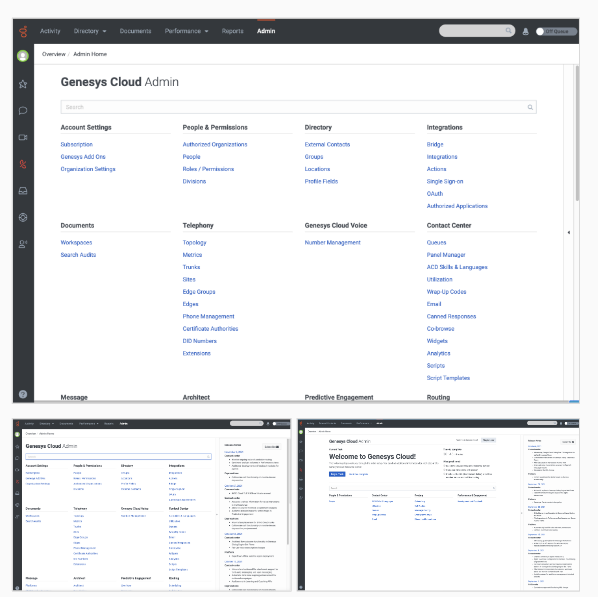
The Admin page is an administrative interface for Genesys Cloud for users with admin role permissions to access certain features and functionality. From here, admins can configure their organization and much more.
EMPLOYER:
Genesys
TIMELINE:
1-2 Month
TOOLS USED:
Miro, Figma, Qualitative and Quantitative research
(1:1 interviews, usability testing, survey), and competitive analysis
MY ROLE:
Lead UX/UI Designer, Researcher, and Collaborator across a cross-functional global team
Where the journey began…
Understanding the Challenge
The administrator page is the core of Genesys Cloud, contributing to its complexity due to its high visibility to internal and external stakeholders at all levels, positions, and permissions. Administrators serve as the architects and overseers of the resources functioning within their contact center, and each admin may have different permissions. This allows them to create user interactions for both inbound and outbound calls or bot flows, monitor call recordings, and conduct reporting and workforce management.
The Opportunity
While quick enhancements offer an immediate opportunity to elevate the user experience, there’s also a valuable long-term opportunity to re-evaluate the information architecture. Through research and a UX assessment of the current administrative page, I identified straightforward, impactful updates that could streamline interactions now, potentially creating a more scalable and intuitive structure by revisiting the information architecture over time.
Utilizing Lean User Experience Methodology
The Thinking Phase
Comprehensive UX Assessment
I conducted a comprehensive UX assessment to streamline the user experience and identify key areas for improvement. Following a Lean UX approach, I focused on rapid insights, iterative improvements, and data-driven solutions to optimize the product’s usability.
- Information Architecture Review
I mapped out the current information architecture, focusing on clarity, ease of navigation, and alignment with user goals. This allowed me to identify redundancies and opportunities to enhance the structural flow of the user journey. - Design Principles Alignment
Grounding my evaluation in core design principles, I assessed the product for consistency, simplicity, and visual hierarchy. This ensured that every recommendation was not only functional but also visually intuitive, supporting a seamless user experience. - Identifying Pain Points through Research and Workshops
Through targeted user research and collaborative workshops with cross-functional teams, I uncovered both internal and external pain points. This step helped prioritize changes that would address actual user needs and business objectives, laying the groundwork for impactful solutions. - Data Analysis
By analyzing existing analytics, I gained insights into user behaviors, drop-off points, and engagement patterns. These data points highlighted specific areas for improvement and informed the prioritization of design updates to achieve measurable results.
This Lean UX assessment laid a foundation for both quick wins and strategic, long-term enhancements, effectively aligning the product experience with user expectations and business goals.
Driven by Data
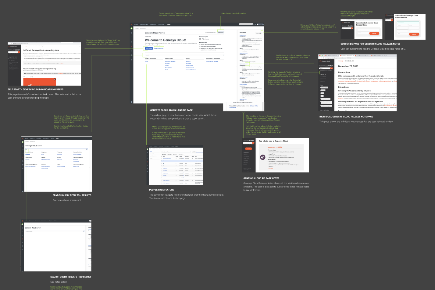
Of the total visits to Genesys Cloud, only 9.3% accessed the Admin page, and just 0.1% interacted with the release notes drawer.
First Interaction: From the initial clicks within the release notes drawer, 62% of users engaged with content, while 36% exited the interaction.
Second Interaction: Following this, 52% of sessions continued engagement, with the remaining 48% dropping off.
Top Pages and Drop Rates:
- Release Notes: November 2, 2021 – 56% drop-off
- Release Notes: October 27, 2021 – 55% drop-off
- Articles – 100% drop-off
- Release Notes Home – 0% drop-off
- Subscribe to Release Notes – 60% drop-off
This data highlights key engagement points and drop-off trends within the release notes drawer, indicating areas for potential improvements in content structure and user engagement.
The Making Phase – Creating a Minimum Viable Product (MVP)
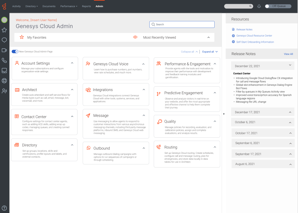
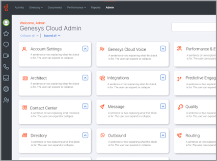
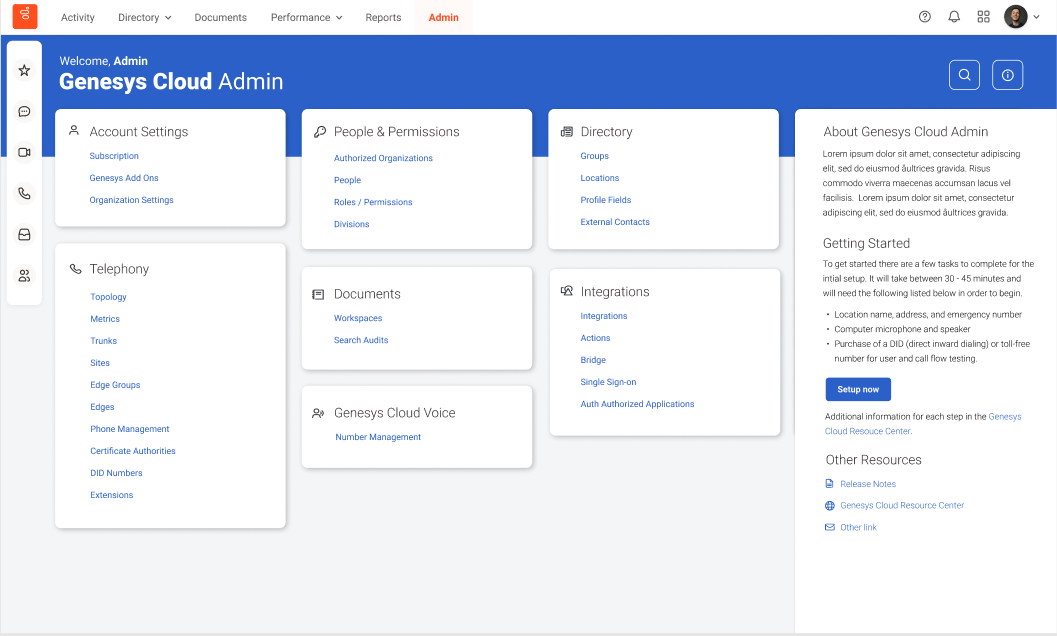
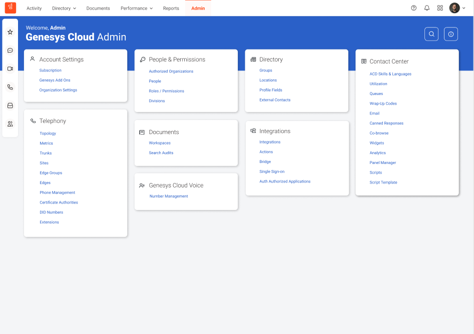
Design Concept One
Explanation
- Use of tiles for each feature.
- Utilizing font size and weight to separate hierarchy.
- Adding personalization.
- Information, setup, and other resources are located within the info area.
- Users can highlight tiles as “favorites,” and they will appear at the top, making them more accessible.
- Tiles are in alphabetical order.
- Search is expandable and collapsible.
- I added icons for visual and quick informational representation.
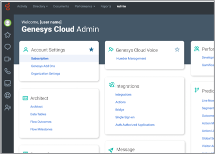
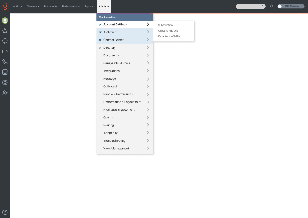
Design Concept Two
Explanation
- Utilizing a mega menu or a dropdown menu for Admin.
- Easy access to features and functionality.
- In the bottom iteration, a user can select their “favorites,” and they would appear at the top of the sub-menu navigation.
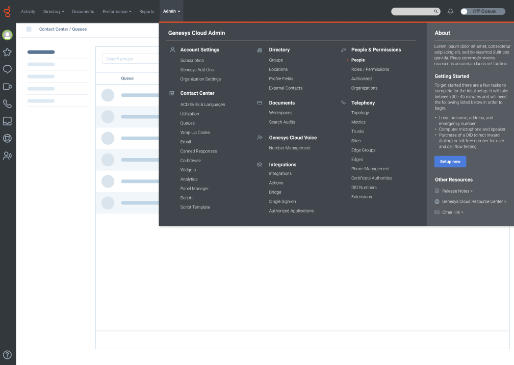
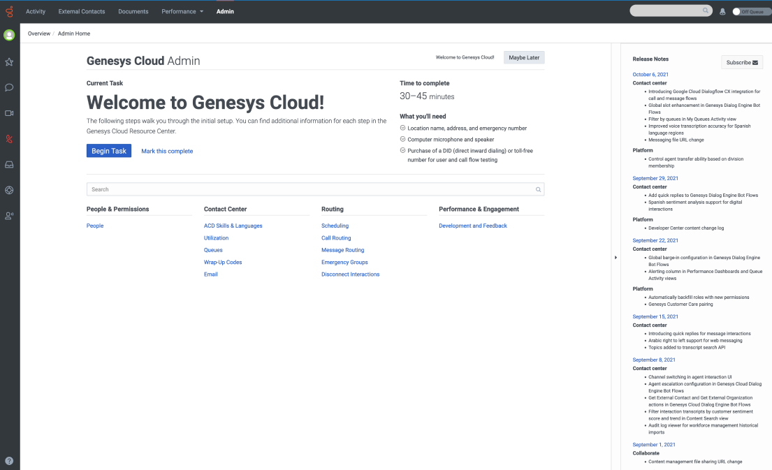
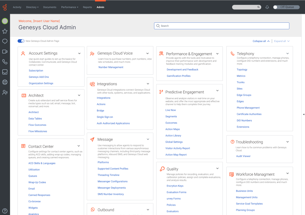
Design Concept Three
Explanation
- Use of tiles for each functionality.
- Utilizing font size and weight to separate hierarchy.
- Add personalization with the user’s name.
- Utilize the right drawer for information, setting up, and other resources.
- Users can collapse or expand all or each tile separately.
- Tiles in alphabetical order.
- The search bar is aligned with the title and doesn’t occupy much room.
- I have added icons and descriptions for visual and informational representation.
- Scalable solution.
- User can click and drag tiles to their desired positions.
User Testing
Design validation was conducted by using UserTesting.com with 12 participants. The participants were located in Australia, Canada, India, United States. Their roles ranged from entry-level to Supervisor or Lead in different industries within a Customer Center.
They were asked to complete the same open-ended questions for each concept and provide corresponding feedback on the three concepts, including the existing design.
Outcome
Overall, the participants preferred a combination between concepts 1 and 2. They liked the flexibility of the collapsed and expandable tiles. They felt it wasn’t overwhelming to them and they could see everything up front with no need to scroll. The least preferred is the original design and also concept 3. They felt it was overwhelming, confusing, and lacked usability.
Next Steps
To take feedback from stakeholders and user testing into consideration to update design concepts. Have internal stakeholders review the designs and get their feedback.
Outcome
The project was put on hold and I since moved on from Genesys to see the efforts through. However, if I were to see it through, I would discuss with the produce owners and engineering to A/B test the options and come up with a hydration plan to fully release the option that had the most successful outcome. The success would be measured by monitoring key metrics, time on task, the voice of the customer, and overall user engagement. I would pay close attention to any pain points uncovered or improvements that could be made to the experience.