The Path to Passwordless Sign In
In today’s digital landscape, secure access without the friction of traditional passwords transforms user interaction. By designing passwordless sign-in and account creation, I’ve crafted an experience that marries simplicity with enhanced security. With this approach, users avoid the stress of managing and remembering complex passwords, which helps reduce entry barriers and supports increased engagement and satisfaction. Passwordless login not only minimizes security risks—such as phishing and password leaks—but also allows users to enjoy swift, frustration-free access, fostering trust and loyalty.
At the intersection of innovation and user-centered design, these solutions set a new standard in authentication, making secure access effortless and elevating the user journey from the very first interaction.
EMPLOYER:
Chewy
MY ROLE:
Lead Product Designer, Researcher, and Collaborator across a cross-functional team
TOOLS USED:
Figma, Design System, and Lucid
Note: The work showcased is designed to highlight my process without disclosing proprietary information.
Where the journey began…
Understanding the Challenge
For many existing customers, signing in becomes a friction point when they can’t remember their password. This seemingly minor hurdle often disrupts the customer journey, forcing users into a lengthy, inconvenient password reset process. They’re taken out of the browser, into their email, and then back again, adding unnecessary steps to a quick interaction.
This experience not only increases the risk of cart abandonment and decreases conversion rates but also leaves customers frustrated and less likely to engage in the future. To create a truly seamless, customer-friendly experience, the challenge is clear: customers need a simplified way to sign-in and create an account, reduce reliance on passwords, and keep users engaged without breaking the flow of their journey.
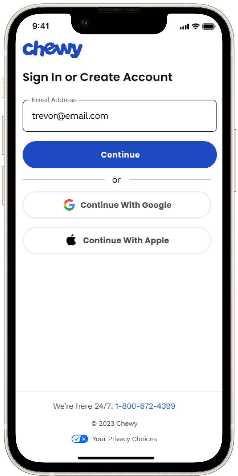
The Original State: Sign In
Existing customers don’t always remember their passwords when signing in. They would be taken out of context and put through a cumbersome process to reset their password. The customer would have to click on “Forgot password,” then enter their email address and await a reset password email, which sometimes doesn’t show up until later, or maybe it is sent to a spam folder. This flow takes the customer out of context by needing to leave the flow altogether to open up their email to retrieve the reset password email, adding friction and increasing the cognitive load of customers.
The Original State: Create Account
Creating a new Chewy account requires customers to create a password or to enter in their social login credentials. As a new customer, the hypothesis is they prefer a more simplified contextual experience.

Utilizing Design Thinking Methodologies
Research and Insights

Design Thinking Workshop
Faciliated a 3-hour design-led workshop with 20+ cross-functional partners. That consisted of three activities that led to impactful solutions to improve the customer experience both short and long term. The activities included reviewing the current experiences, inspirational experiences, and a crazy 8 activity. Once the workshop concluded, I synthesized the findings into themes and categories and then created How Might We statements that drove roadmap iniatitives.
Industry Standards
To understand industry standards and I performed domain research to gather insights to better understand customers behavior and mental models to help guide, baseline and establish best practices. I researched over a dozen companies end-to-end sign in, create account, and reset password user flows. Third party research tools were also used which aided me to uncover what designs cause usability issues, and how to create the best experience for customers.
User Flows
I created user flows for all scenarios to uncover pain points and resolve points of friction.
Design Approach
Ideation Phase
During the ideation phase, I explored possibilities for enhancing the sign-in and account creation flow. I started with brainstorming sessions to generate diverse, innovative ideas, staying open to unconventional approaches. From there, I created low-fidelity mockups to visualize and iterate on multiple concepts quickly. These initial sketches were intentionally rough, allowing us to stay nimble and iterate without over-investing in details.
Using Figma, Miro, and Confluence for documentation, I worked closely with content designers, stakeholders, and cross-functional partners to refine the experience and align with our shared goals. Collaboration was key; these tools enabled us to capture feedback and effectively track real-time decisions. Proactively communicating with engineering, product, accessibility, and customer service, we reviewed the constraints and opportunities posed by our current tech stack, particularly around email dependency. The goal was to ensure that any new functionality would integrate seamlessly without adding unnecessary friction to the user experience.
Through this exploration, we uncovered additional opportunities for improvement beyond the core sign-in and account creation flows. The ideation process revealed enhancements to password reset flows, social login integration, and even ways to incorporate one-time codes across the user journey. I regularly reviewed and tested our assumptions as a team, maintaining a mindset of “do no harm.” For instance, we emphasized button hierarchy to keep actions clear and focused, ensuring accessibility and ease of use for every customer.
By the end of this phase, I had developed a solid set of lo-fi concepts that resonated with our immediate team and set the foundation for a more seamless, user-friendly experience that we felt as a team could support Chewy’s goals for growth and engagement.

Ideate
Now that I understand the user’s and business needs and the application’s current state, I ideated with wireframes and progressed into low-fidelity mock-ups to test and present several solutions. During the ideation phase, I collaborated with the stakeholders and developers while working in two-week sprints. At each end of the sprint, I presented solutions and worked through any technical limitations or concerns the teams may have had.
After the initial low-fidelity mock-ups, I realized we needed to consider the type of device Lenovo Welcome was launching on and the type of user. Each device and sector had different branding and needs or wants.
For example, the Legion device was dark-themed and for gamers. Gamers wanted different offerings, and I wanted to make sure the experience wasn’t jarring and valuable but also educational. Another example is Consumers, such as personal, educational, or even business users, who use Chromebooks, IdeaPads, and Yoga devices. Their branding was more light-themed, and their offerings would be much different than those of business or gaming.
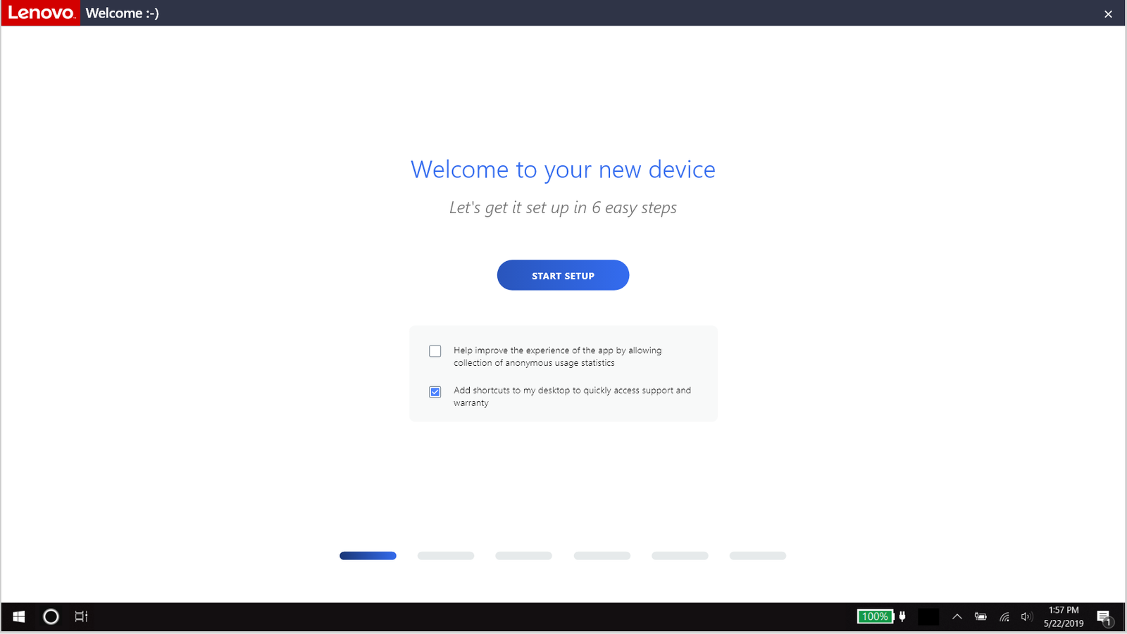
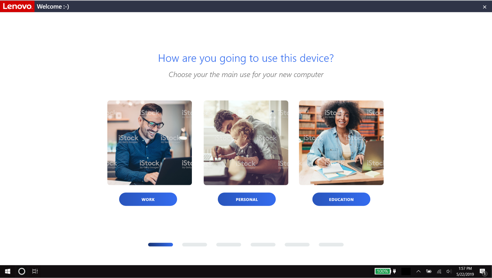

The first iteration of a low-fidelity mock-up to start the conversation and brainstorming.
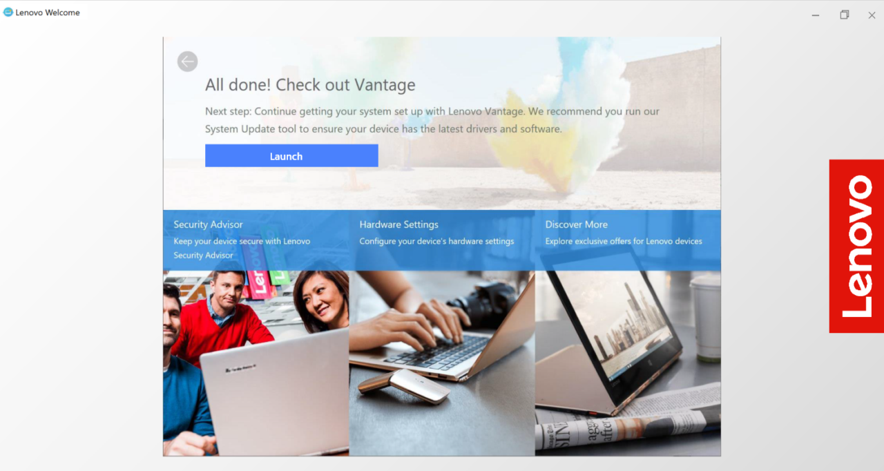
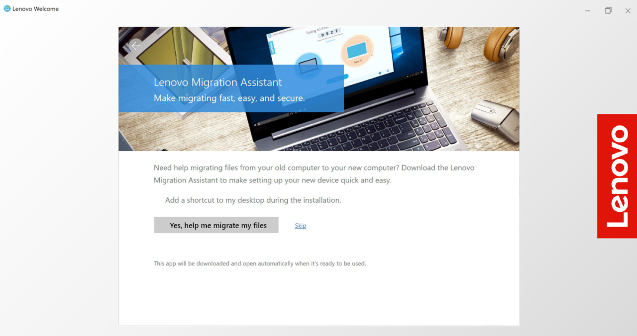
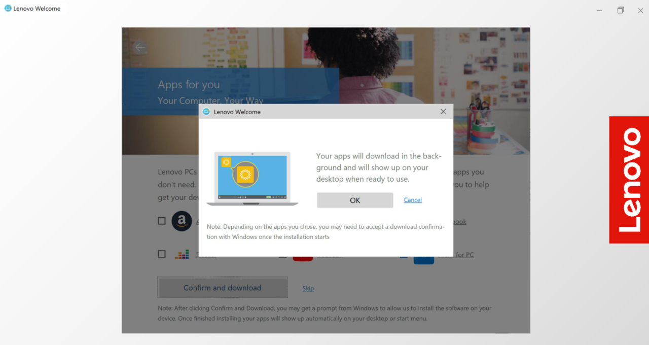
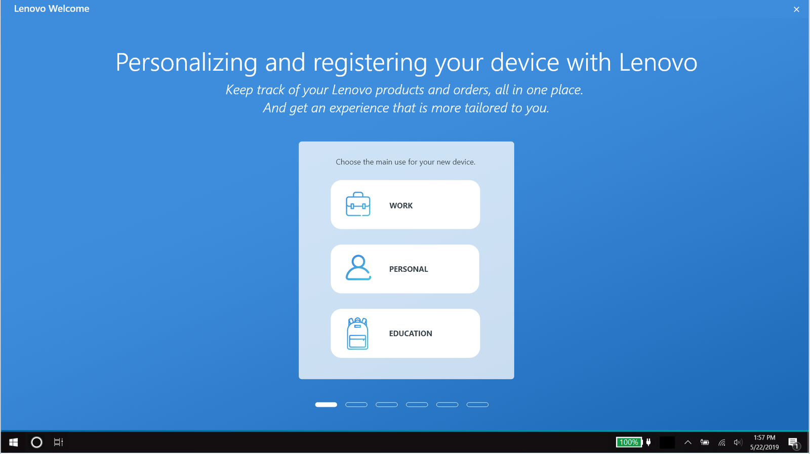
Prototype
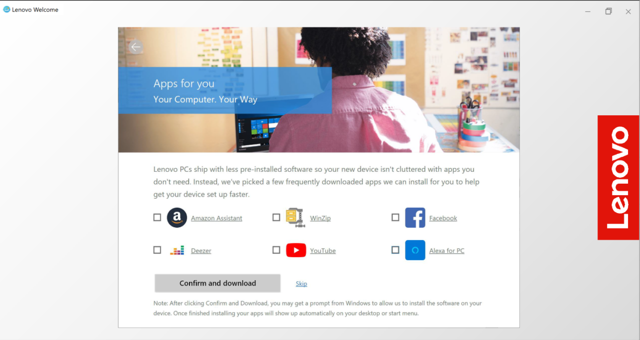
Below is the Legion flow and also the Personal, Work, and Educational flows that launched. Depending on the device the user has will depend on what type of experience they will receive. And then, once the user chooses what best describes how they will be using their device, is what type of offers and information will be shown to them, minus if they already have one of the applications or offers installed.
Gaming Theme
Personal and Business Theme
Test, Implement, and Repeat
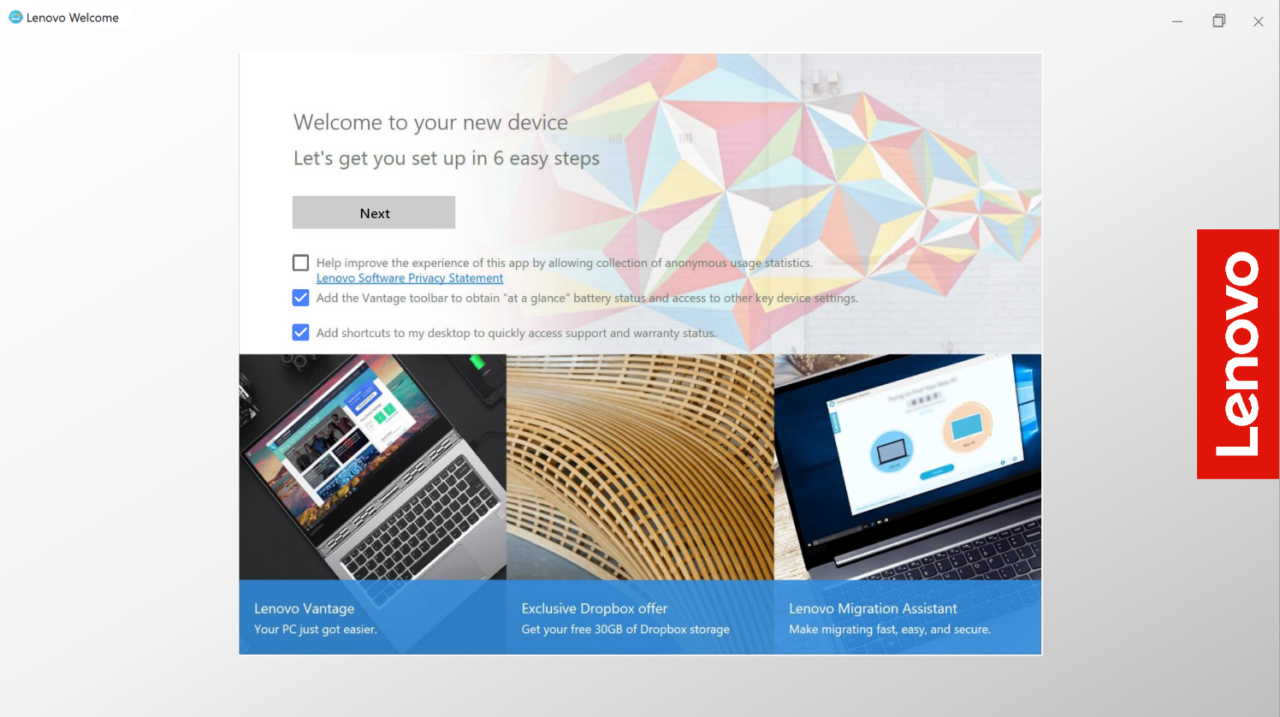
Additional testing before and after launch showed an improved customer experience compared to the original benchmarked experience. Lenovo Welcome is now a responsive experience that appears immediately after the Microsoft Onboarding, but the user is able to either complete or come back to Lenovo Welcome at their own time. Below are listed some improvements that have improved the experience.
- Personalization
- A compact, short, and memorable experience with the customer in mind
- Lenovo branded
- Product Registration
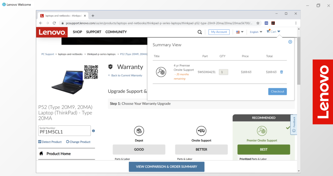
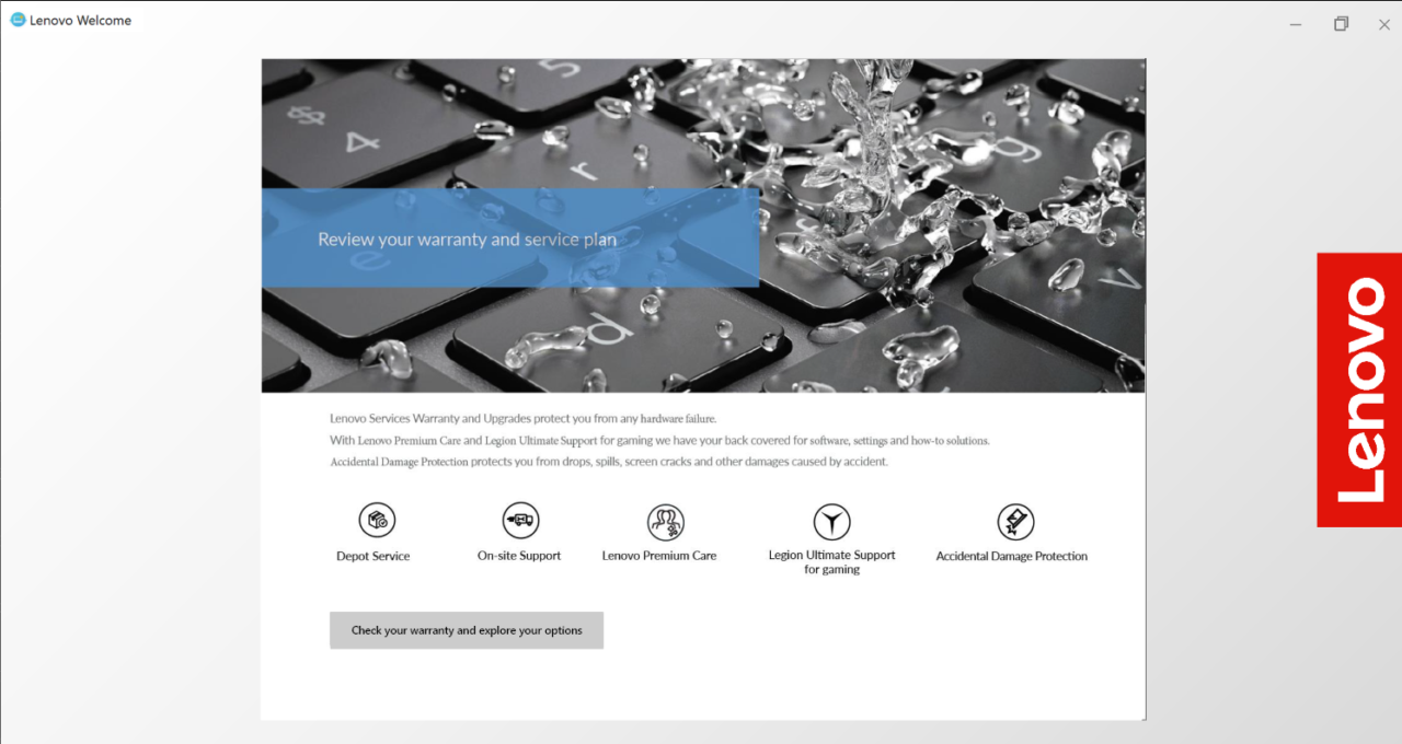
- In-app purchases for a warranty upgrade
- Valuable free or subscription-based offers
- Apps for You to download popular applications (downloaded in the background)
- Discovery page to educate the user on their device